
Sunday, 31 October 2010
Monday, 25 October 2010
THE LETTER J
Within one of my workshops at London College of Communication we experimented with typography. We looked at the principles and terminology of type. We also experimented by playing with the scale, recomposing and layering our chosen letter. Here are some of my own,


I also played with type by considering two words at the same time, being soft and another word...

I found merging soft and order more challenging then others. The two seem a bit of an oxymoron however I think my result was an interesting approach.

I think the reason this experiment worked was a combination of using the outline of a sans-serif typeface and using a heavy b type pencil.

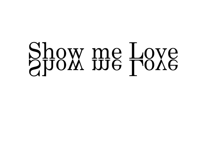
Recomposing.

My workstation.

I found merging soft and order more challenging then others. The two seem a bit of an oxymoron however I think my result was an interesting approach.

I think the reason this experiment worked was a combination of using the outline of a sans-serif typeface and using a heavy b type pencil.
Friday, 22 October 2010
YELLOW CHICKEN NUGGETS
I went to the YCN building near Hoxton Square last Friday. I think YCN has a great ethos around all of its work and I am even more impressed with its schemes to try and help young and upcoming designers, like myself, the valuable opportunities we need within the industry. Whilst I was there I was also told that the lady sitting behind the macbook was in fact the lady within the Becks poster adverts.

She was nice enough to give me a quick cheeky photo.
Thank you YCN.

She was nice enough to give me a quick cheeky photo.
Thank you YCN.
Sunday, 17 October 2010
FREEZING COLD ART
I took a trip to Frieze Art Fair at Regents Park on Sunday. It was a great fair which I thought had not only great talent, but also each company got a great space to do what they did best, show off art!


I thought these three pieces by Hiromi Yoshii were extremely refreshing with not only great use of white space, but also very carefully chosen illustrations within the three silhouettes.
Also please watch this video in fascination as I did actually being there!
Thank You FAF.


I thought these three pieces by Hiromi Yoshii were extremely refreshing with not only great use of white space, but also very carefully chosen illustrations within the three silhouettes.
Also please watch this video in fascination as I did actually being there!
Thank You FAF.
Thursday, 14 October 2010
ONE THING LEAFS TO ANOTHER.
Within a group session at London College of Communication I was shown some work by Bruno Munari. More specifically a page out of the book "Air made visible". I found his work extremely interesting and here are some of my own drawings from the session.


I think the most important thing I took from this session was that you can make everyday mundane objects into new and exciting things. I believe that you just need to look at something hard enough with a different perspective and you can make something much more visually exciting for both you and the viewers.
I will try and take this with me when designing.
 | |
The leaf photocopy that all my drawings came from.

This diagram was drawn using the main points on the nerve system to the outer points of the leaf.

This is using the negative of all the important parts of the leaf.

My work in progress.
I think the most important thing I took from this session was that you can make everyday mundane objects into new and exciting things. I believe that you just need to look at something hard enough with a different perspective and you can make something much more visually exciting for both you and the viewers.
I will try and take this with me when designing.
Thursday, 7 October 2010
ELECTRIC BLUE GALLERY
I visited the Electric Blue Gallery on their opening night of FACES.
Not only was their thought provoking art along with a lively atmosphere, but there was unlimited supplies of alcohol and Adam And The Ants guitarist Mark Ryan playing the chilling "prince charming" as you walked in.
"Man this gallery knows how to roll" I thought.

Thank you EBG
Faces
Sep 16 - Nov 16 2010
Eine, Zevs, D*Face, Jasper Goodall, Rafal Zajko
Not only was their thought provoking art along with a lively atmosphere, but there was unlimited supplies of alcohol and Adam And The Ants guitarist Mark Ryan playing the chilling "prince charming" as you walked in.
"Man this gallery knows how to roll" I thought.

This was my favorite piece of the night, bringing together a well known and saintly idol to many, John Lennon, having his face repeatedly attacked with the thick clumpy dark acrylic paint and the yellow haunting stains dripped down the side of his face. Immediately you zone in staring for a whole minute without paying attention to anyone, especially not the man standing behind you with a small white fluffy dog trying to lick the back of your neck, as this piece is so dark and inspiring
Thank you EBG
Faces
Sep 16 - Nov 16 2010
Eine, Zevs, D*Face, Jasper Goodall, Rafal Zajko
Subscribe to:
Posts (Atom)